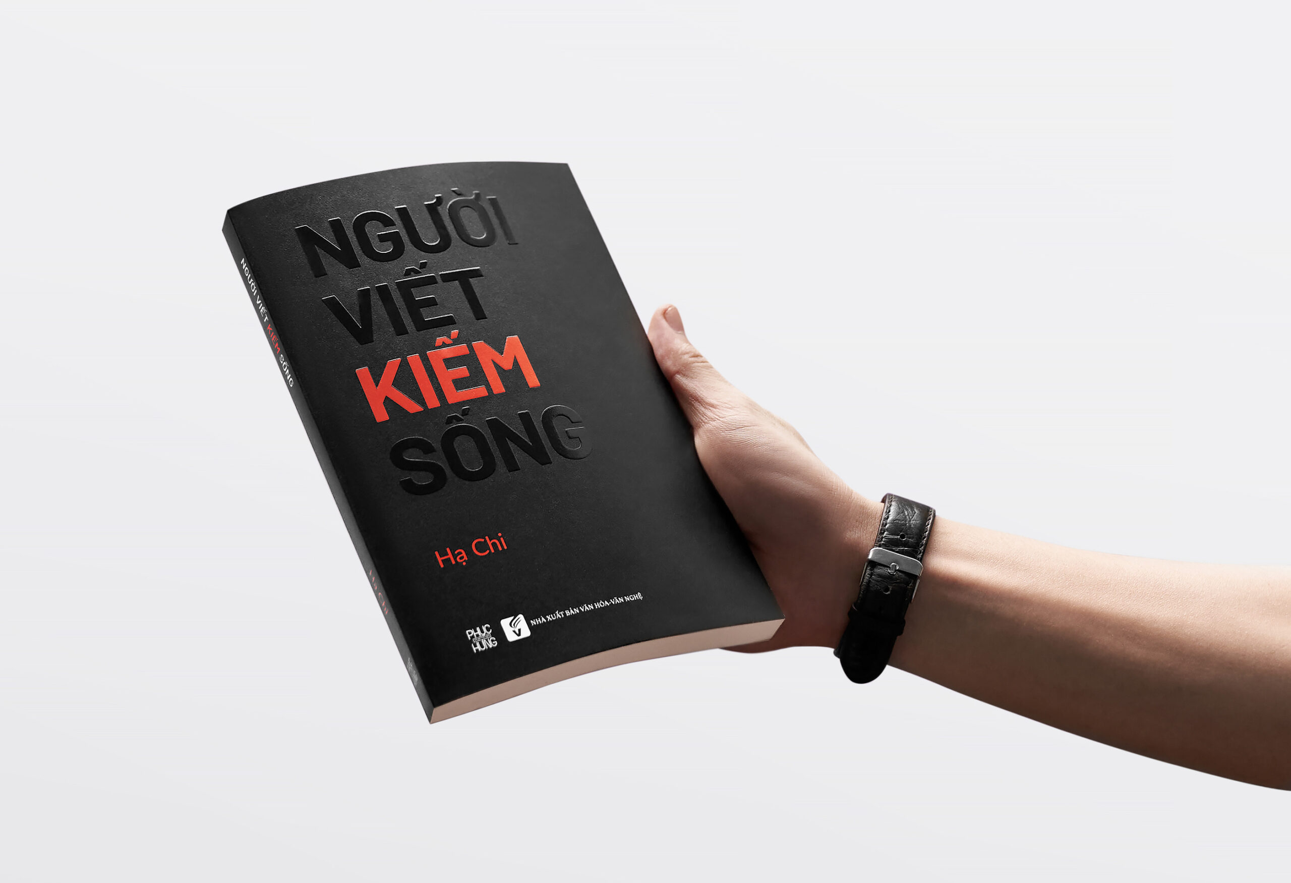
As the designer of Người Viết Kiếm Sống (Writers Who Make a Living), I wanted the book’s visual identity to reflect both the creative journey and the realities of sustaining a writing career. Hạ Chi’s decade-long experience as a writer and copywriter is deeply personal yet universally relevant, and my goal was to create a design that enhances her storytelling while inviting readers to engage with the content on a deeper level.
The cover design plays with the dual meaning of the title—Người Viết Kiếm Sống can mean both “searching for a living” and “searching to become a writer.” This theme is expressed through a striking contrast: Người (Person), Viết (Write), and Sống (Live) are UV-printed in black on black, blending subtly into the background, while Kiếm (Search/Earn) stands out in bold UV-printed orange. This highlights the significance of the search (Kiếm)—both for purpose and livelihood—immediately drawing the reader’s eye to the core message of the book.
Inside, the layout is designed with clarity and engagement in mind. Ample space on each page encourages readers to take notes, making the book an interactive experience rather than just a passive read. The structure follows key milestones in Hạ Chi’s career, and I aimed to mirror this journey through an editorial design that feels both open and intentional. The result is a balance between elegance and playfulness—resonating with the creative process while acknowledging the practical challenges of making a living as a writer.
By blending thoughtful design with meaningful storytelling, I hope this book speaks not only to Vietnamese readers but also to an international audience interested in the realities of writing as both an art and a profession.

The book’s cover design plays cleverly with the title’s double meaning, which can be interpreted as both “searching for a living” and “searching to become a writer.”


