
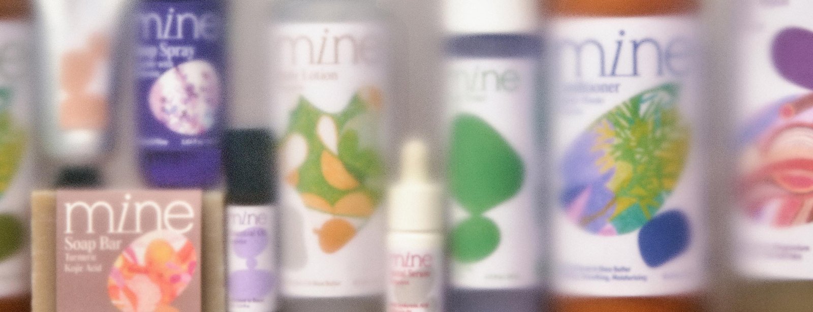
MINE is a scent-led brand built around the connection between fragrance and emotion. More than just a sensory experience, scent can become part of our everyday relationship with ourselves. It can bring comfort, help us reconnect with our feelings, and create a quiet space in the middle of a busy day.
This idea became the starting point for MINE’s brand identity and packaging. We wanted to explore how something as intangible as emotion could be translated into a visual experience, while keeping the brand approachable, thoughtful, and relevant to everyday life.
At the heart of the concept are two complementary dimensions: State of Minds and Life Moments. State of Minds represents our internal emotional states, such as Calm, Ease, Focus, Energy, and Depth. Life Moments reflects the different contexts of daily life, from Morning and Midday to Afternoon, Evening, and Night. Together, they create a flexible framework that connects how we feel with what we experience throughout the day. This approach allows each scent to have its own emotional character while remaining part of a larger brand experience.

The visual identity was designed to express this balance between structure and emotion. The primary wordmark establishes a clear and refined brand presence, while the secondary monogram provides a more compact recognition mark. Built around balance and symmetry, the monogram abstracts the letterforms of MINE into a distinctive symbol. The typography pairs an editorial serif with a contemporary sans serif, bringing together character, warmth, and clarity. Color also plays an important role in the system, helping distinguish different product directions and emotional states while maintaining a consistent visual identity.
Developing the packaging system meant finding a way to accommodate different scents, emotional states, and product formats without losing visual consistency. We established a clear information hierarchy, giving priority to product identification, function, and readability. Around this foundation, graphic elements and illustrations introduce individuality and help communicate the character of each product.
One of the key visual elements is a series of abstract, rounded forms inspired by the idea of personal space and emotional boundaries. These shapes can stand alone or overlap, creating different compositions that reflect the way emotions naturally shift and coexist. Their scale and arrangement bring variation to the visual system, allowing each composition to express a different feeling without relying on literal imagery. The forms are intended to be open to interpretation, much like the personal experiences and emotions they represent.


llustration became another important part of bringing the concept to life. We developed a collection of custom, hand-drawn elements to represent individual states, feelings, and moments. Rather than describing the products literally, these illustrations act as emotional markers within the packaging system. Their expressive lines and naturally imperfect qualities preserve the character of the drawing process, giving the brand a more personal and human touch.
Craftsmanship played an important role throughout the visual development. Time was spent exploring forms, refining compositions, and drawing each illustration by hand. We chose to embrace subtle irregularities rather than make every element feel perfectly controlled. These details bring a sense of warmth and tactility to the overall identity, creating a balance between the clarity of a structured graphic system and the spontaneity of handcrafted expression.
Across branding, packaging, illustration, MINE brings together a thoughtful visual system with a more expressive and handcrafted approach. The intention is to create more than a consistent product identity. It is to build a visual world that reflects the emotional role of scent and encourages people to slow down, pay attention to how they feel, and reconnect with themselves through everyday moments.
MINE. Sense it. Feel it. Live it.


