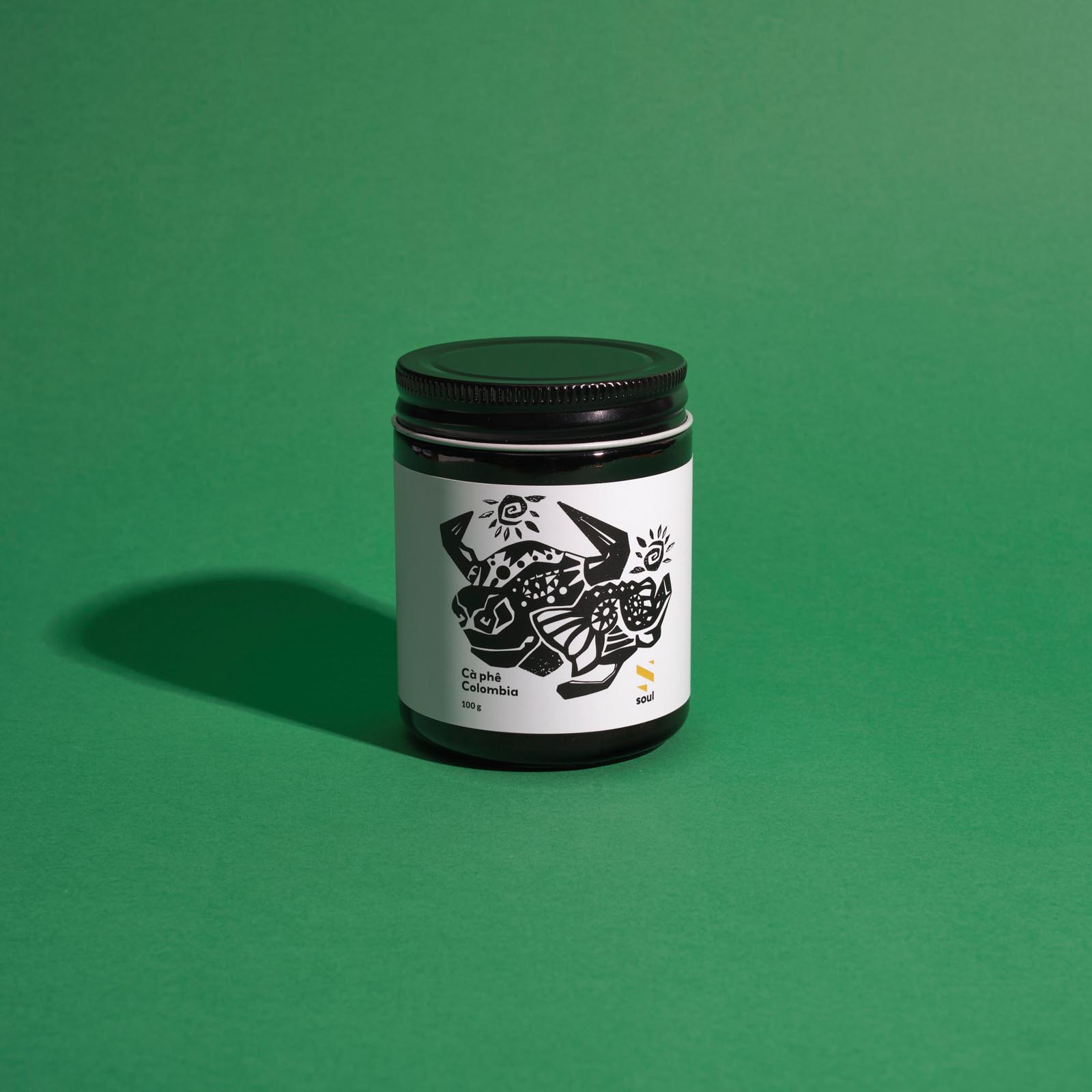
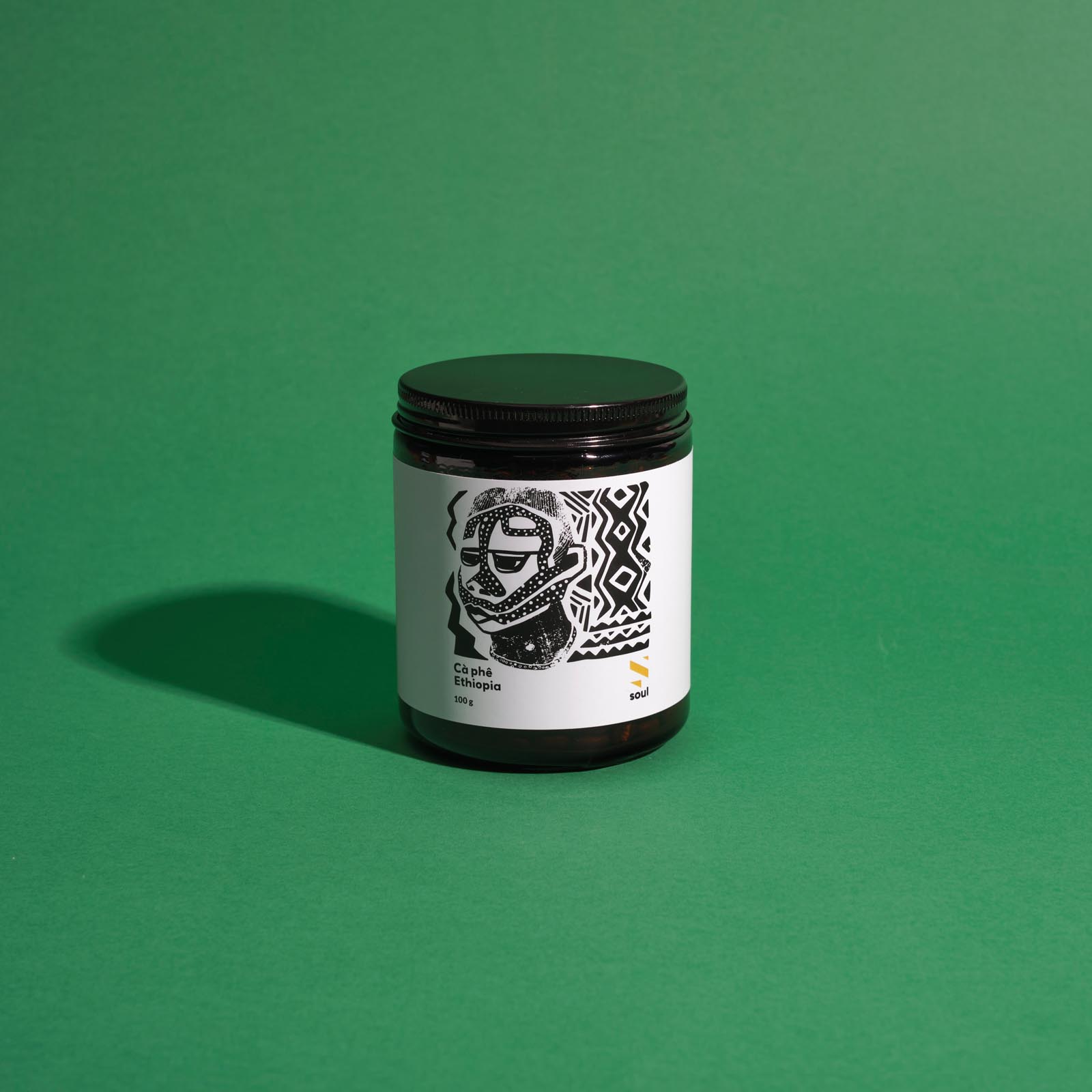
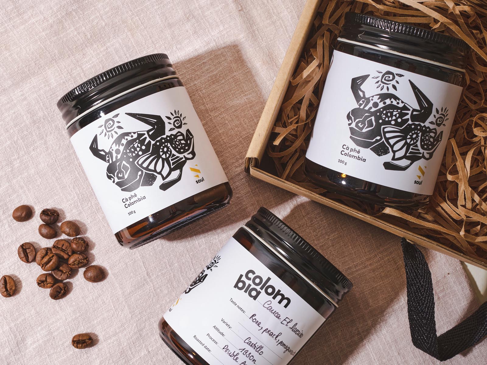
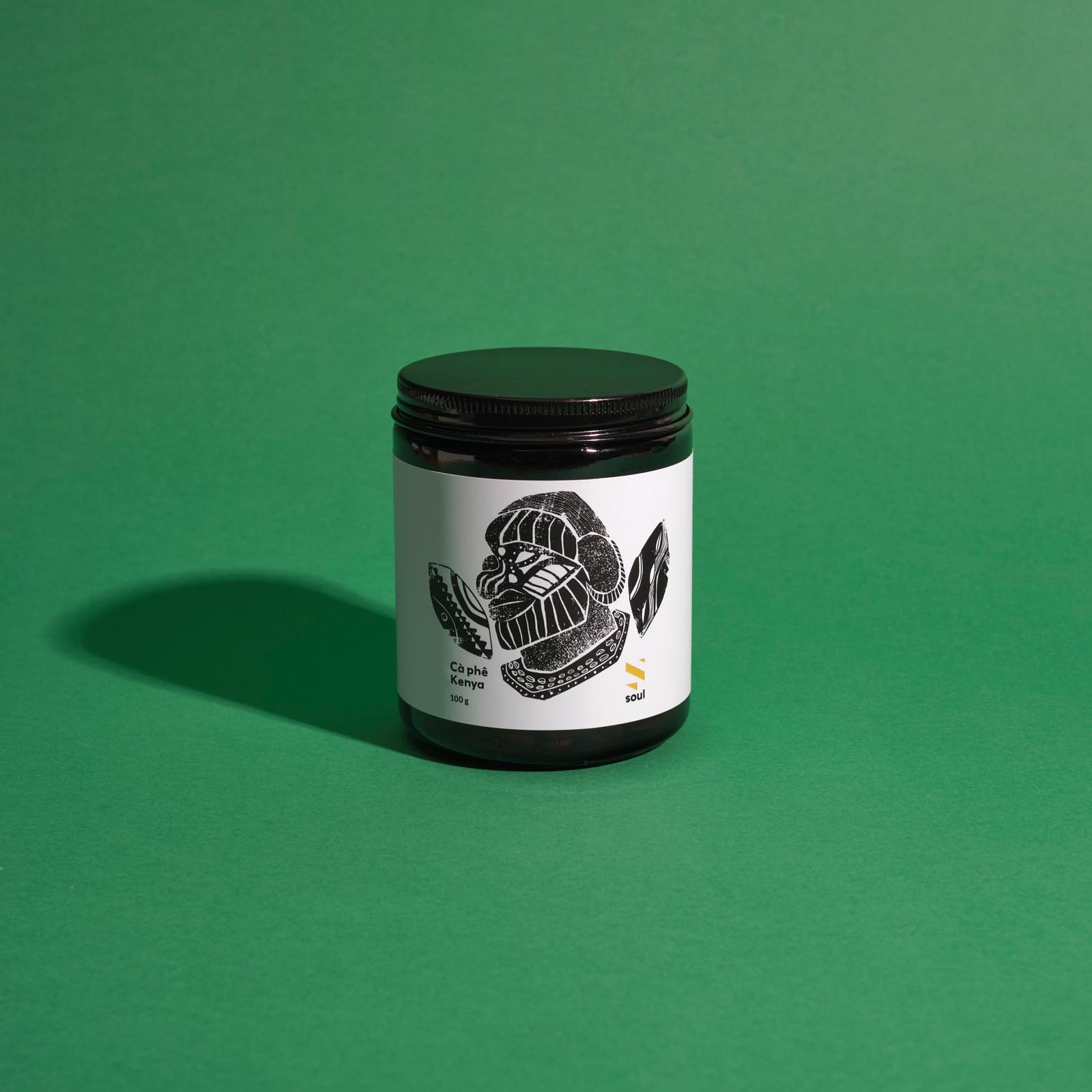
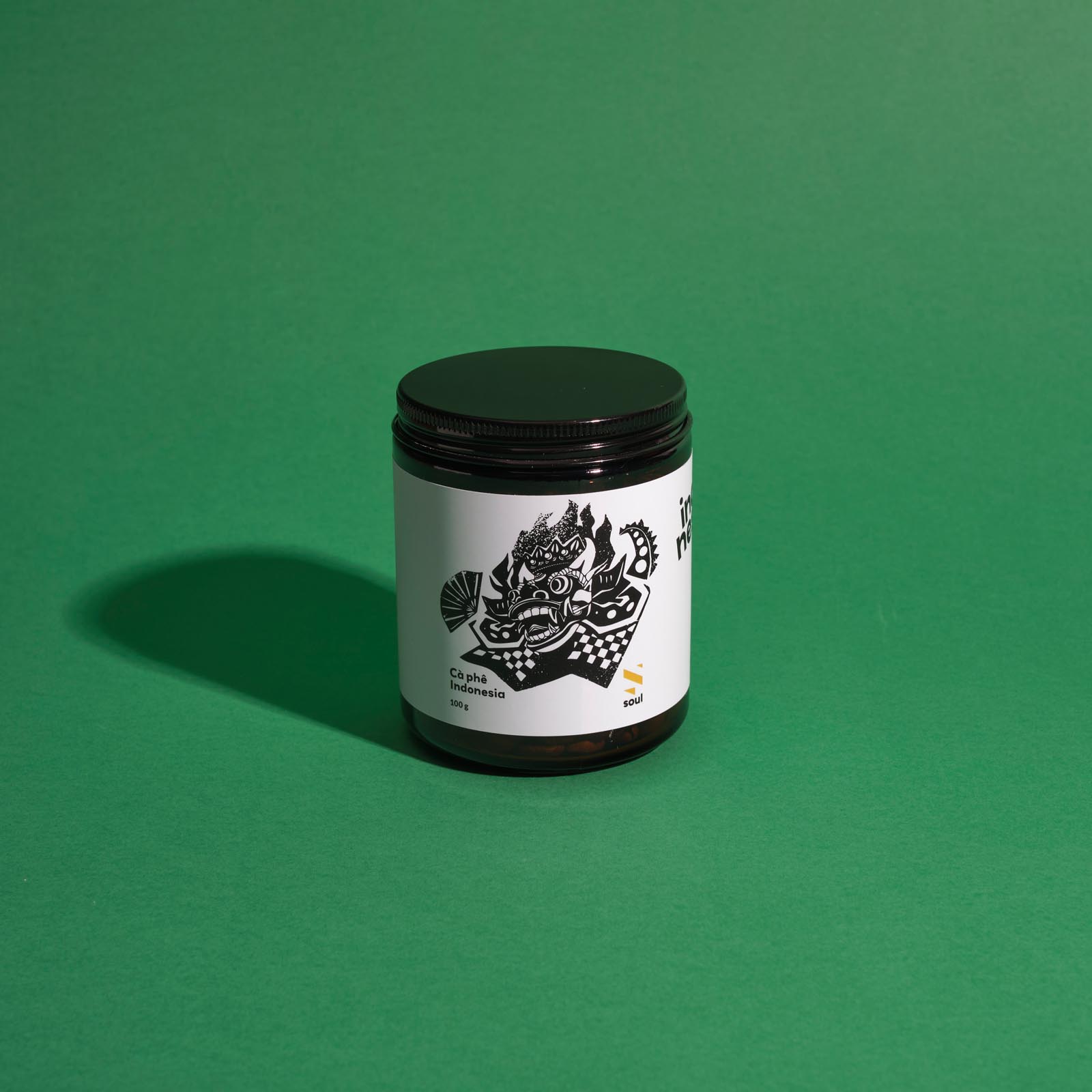
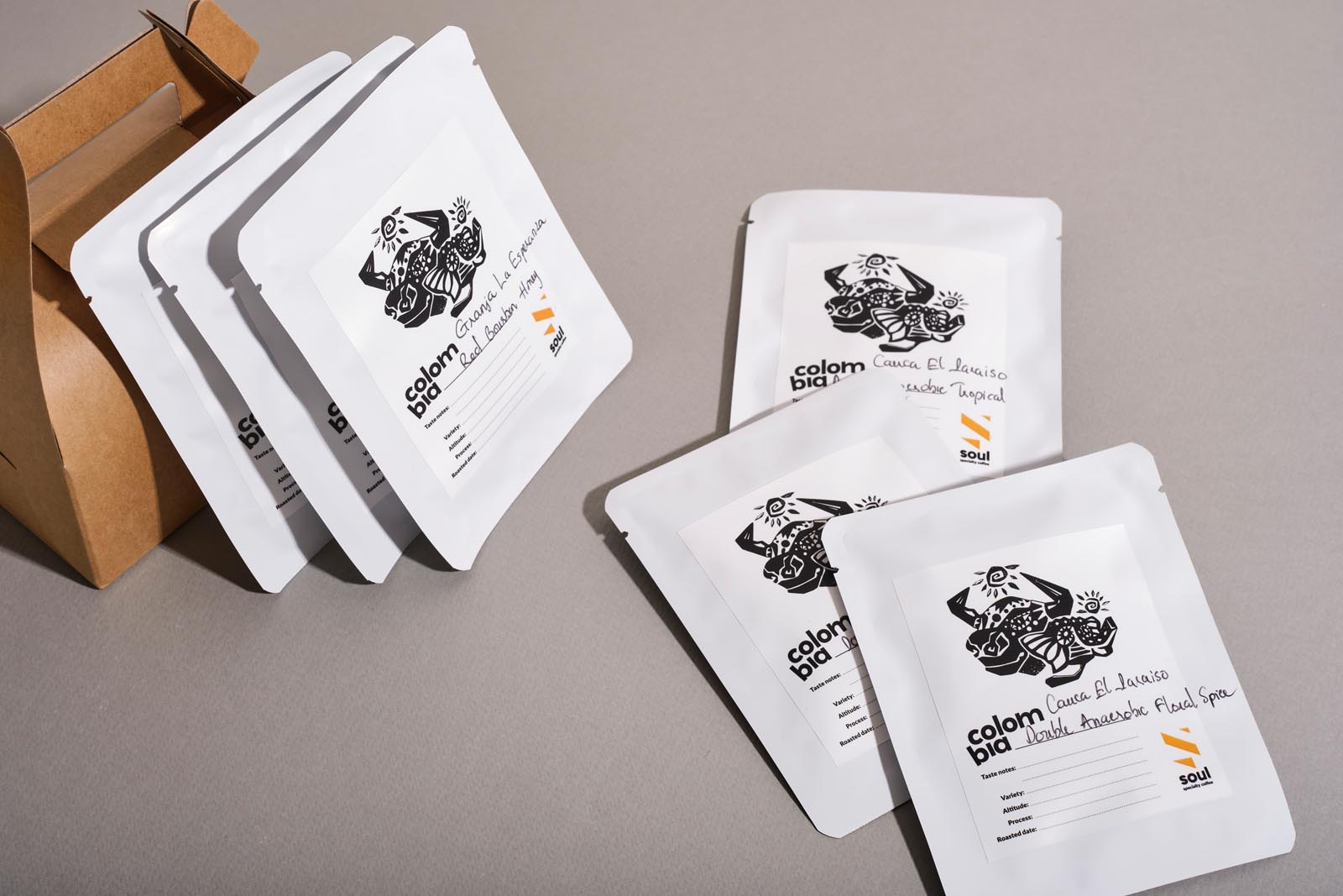
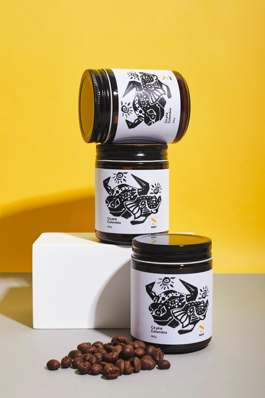
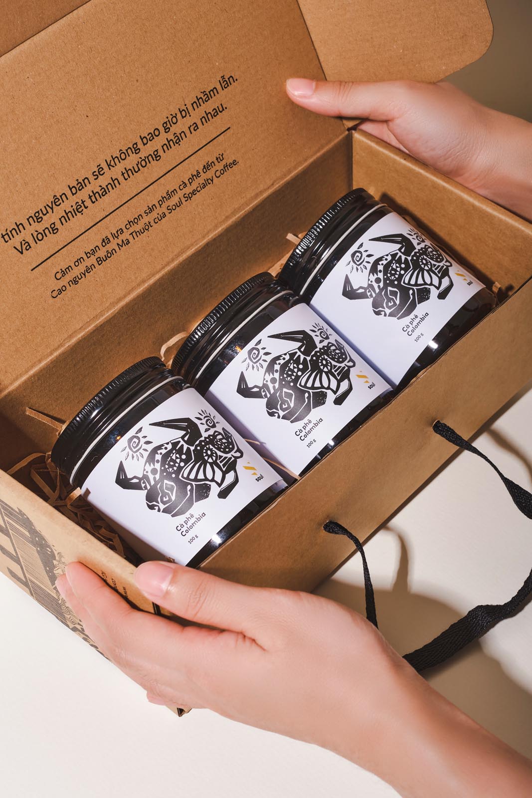
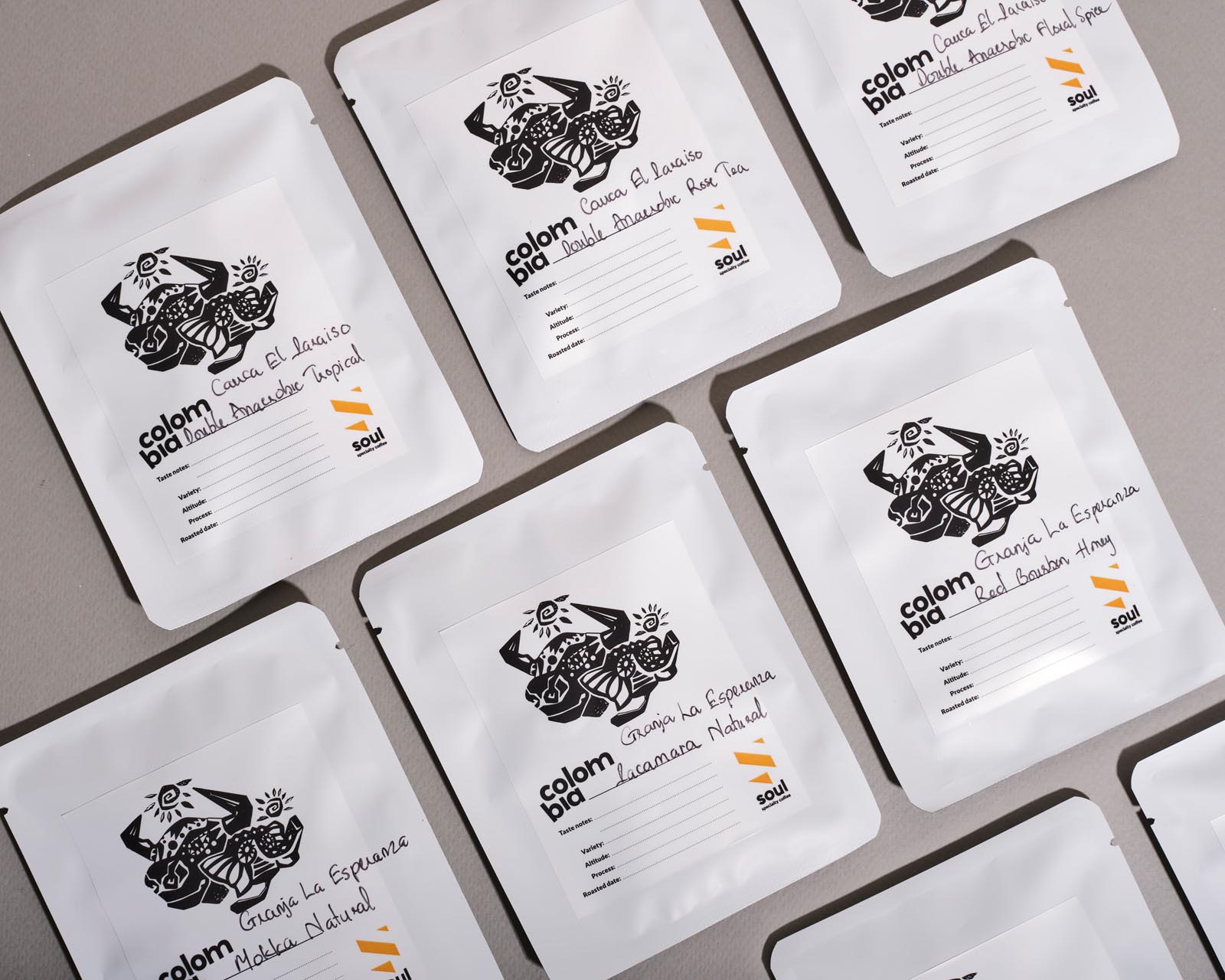
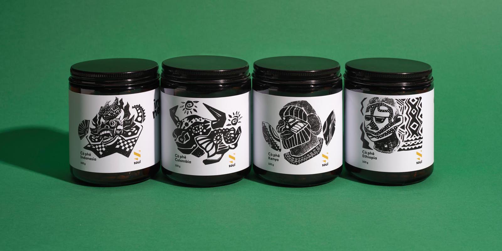
The graphic and label design for this coffee can explores the multifaceted concept of the face as a symbol of cultural diversity. From the familiar contours of human faces to the enigmatic allure of cultural masks, each visage carries a narrative of its own. By juxtaposing these representations, the design encapsulates the rich tapestry of global cultures. Just as the human face reflects myriad emotions and experiences, so too does the coffee bean serve as the quintessential visage of its origin culture. Through this lens, each brew becomes a journey, inviting coffee enthusiasts to explore the nuances of taste and tradition, as diverse as the faces that adorn this captivating design.
The technique employed in crafting the labels for these coffee cans draws inspiration from the timeless artistry of woodcut printing. Each “face” design is meticulously carved with bold, striking lines, imbuing the label with a powerful visual presence. The use of deep, rich black hues enhances the strength and prominence of the design, mirroring the robust flavor profiles of the coffee within. Much like the intricate layers of cultural stories woven into every bean, the label’s boldness demands attention, inviting consumers to delve deeper into the depths of flavor and heritage encapsulated within each brew. This synergy between technique and design captures not only the essence of the coffee but also the profound narratives that accompany it on its journey from bean to cup.
