This project was developed for NOMAD, a cold brew coffee brand based in Saigon, for the launch of their Coffee in Bag series. From the outset, the name itself suggested a clear creative direction. “Nomad” evokes movement, curiosity, and a quiet sense of freedom. It reflects a state of being untethered yet present, drifting through places and moments with awareness rather than urgency.
This idea is deeply rooted in human history. For the majority of our evolutionary timeline, humans lived as nomadic communities, closely connected to nature and its rhythms. Only within the last ten to twelve thousand years did settled life begin to take shape. Rather than representing instability, the nomadic condition can be understood as a form of attentiveness. It is a way of observing, adapting, and existing with fewer material constraints, often accompanied by a more open and receptive state of mind.
From this perspective, the visual direction for the series was shaped under the concept “Wanderers of the World.” The illustrations follow silent travelers moving through expansive and surreal environments. They appear across vast star-filled skies, within deep forests illuminated only by moonlight, and over open landscapes under shifting auroras. The wanderers take on different forms, from a solitary figure to a black horse, or even the aging moon itself. They do not seek to conquer. They move to observe, to exist, and to experience the passage of time and space.
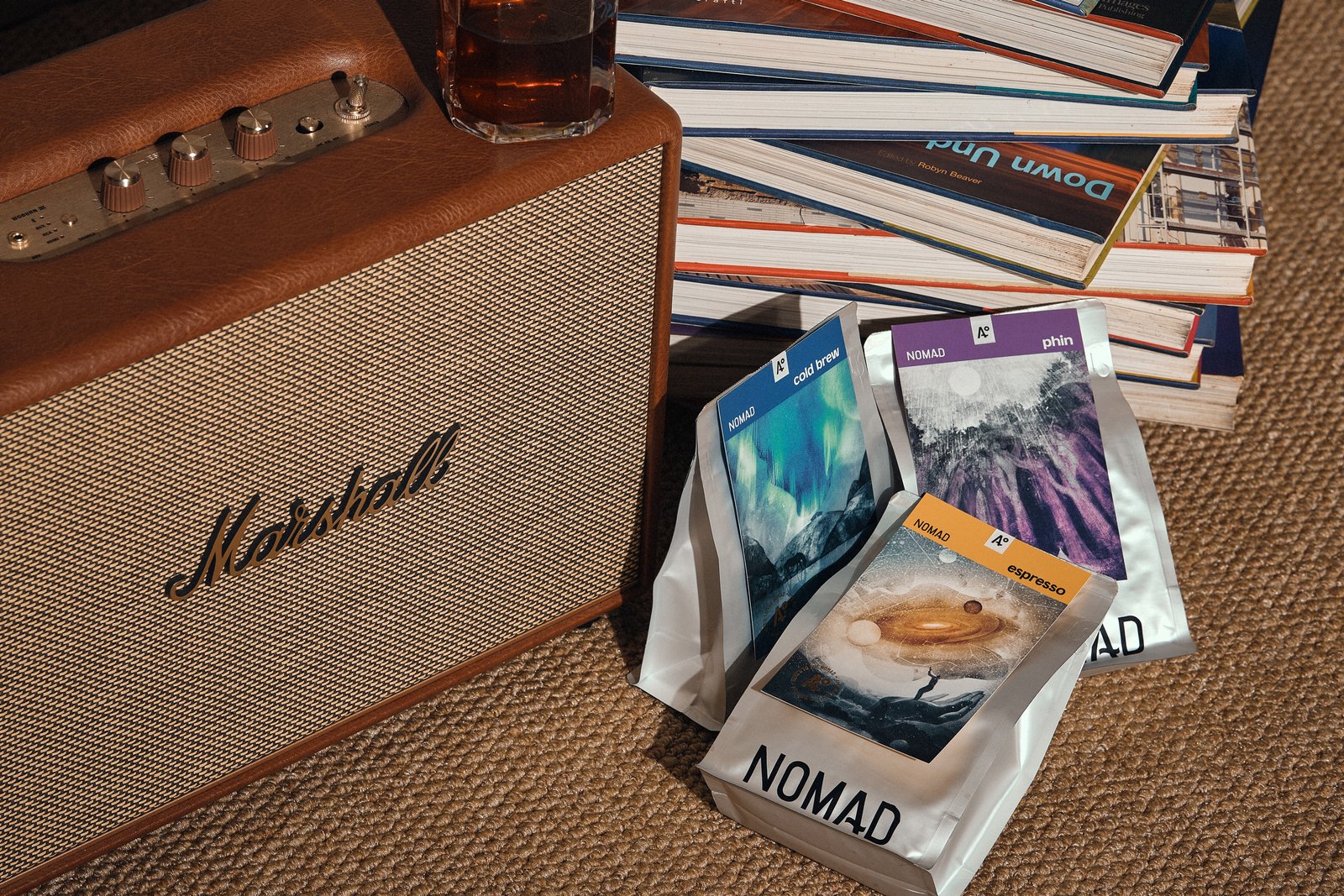
This quiet presence mirrors the nature of the product. Like a slow brew, the journey is unhurried, allowing depth and character to emerge gradually. Each illustration is paired with a specific coffee type, including Espresso, Cold Brew, and Vietnamese Phin. The scenes are unified by a nocturnal atmosphere, creating a consistent tone of calm, introspection, and subtle mystery throughout the series.
The artworks were hand-drawn in pencil on textured paper, resulting in a soft, grainy quality reminiscent of dust or stardust settling in the night. This tactile approach reinforces the sense of stillness and intimacy within each composition.
In the packaging design, the illustration is treated as the central element. Each label functions as a simple tag attached to a silver metallic pouch. The reflective surface interacts with light, enhancing the contrast with the subdued tones of the artwork. The label is designed to be both informative and collectible, allowing customers to engage with it beyond the moment of purchase.
Although contemporary in its application, the project carries a quiet reflection on something more enduring. The instinct to move, to explore, and to step beyond the familiar may no longer define how we live, but it continues to exist within us. In this series, that instinct is translated into a visual language that connects coffee, journey, and a deeper sense of presence.


