After seven years, poet Nguyễn Thiên Ngân returns with a new poetry collection, Người là một bóng chim khuê tú (The Silhouette of a Noble Crane). This book isn’t just a collection of her poems—it’s a deeply personal journey. It traces her struggles, her search for meaning, and ultimately, her acceptance of her true self. Moving from confusion to clarity, from resistance to embrace, it captures the raw, unfiltered process of self-discovery.
The title, taken from one of her poems, evokes the image of the demoiselle crane—elegant yet resilient, fragile yet unyielding. This bird is known for its extraordinary migration, braving harsh winds and crossing the towering Himalayas to reach the south. That symbolism became the foundation of the book, shaping not only its themes but also its design.
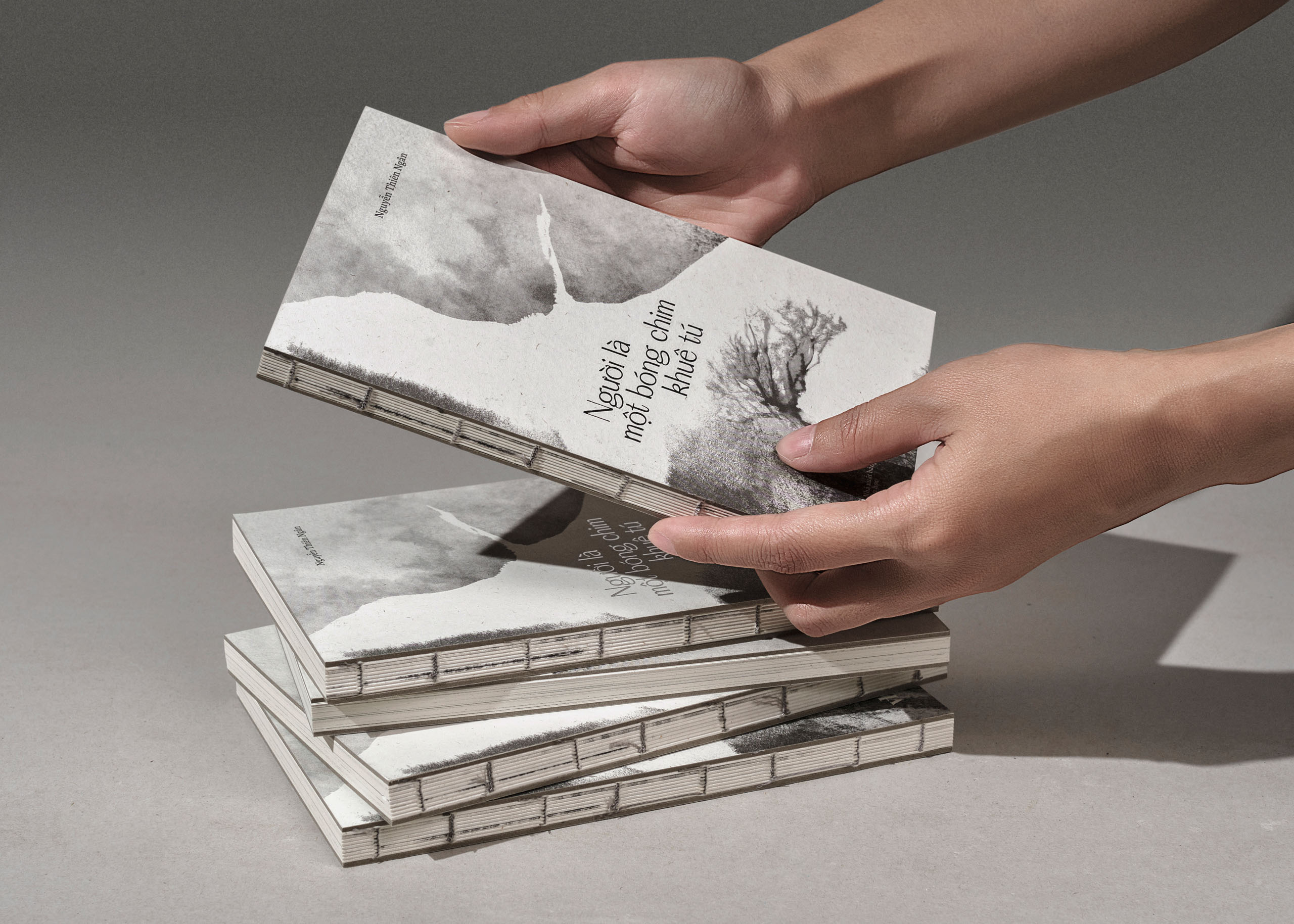
Crafting the Book as an Experience
From the beginning, we wanted the physical form of the book to reflect the emotional honesty of the poems. The decision to use an exposed spine with Coptic stitching came naturally—it is a binding method that reveals everything. Nothing is hidden, every thread is visible, and the structure feels open and unguarded, much like the journey Ngân shares through her writing.
To understand how the book should feel in the hands, we created a fully hand-stitched prototype—raw, tactile, and imperfect in the most human way. It helped us refine the proportions, the spine’s movement, and the overall reading experience. The final book is printed entirely on Magic Comma art paper, whose gentle texture brings warmth and quiet intimacy to every page turn.

The Presence of Handwriting
From the early creative phase, we considered incorporating Ngân’s handwritten poems—an intimate gesture that adds authenticity to the reading experience. Ngân’s handwriting appears at key moments. The first poem opens in her handwriting, immediately drawing readers into her world and signaling that they are entering something deeply personal. It returns again at the end, closing the book the way it began—with the poet’s own hand. These moments act as quiet markers of presence, reinforcing the idea that this journey isn’t just hers—it’s one each of us takes in our own way.

Visualizing Emotion
To visualize the emotional journey, we created a series of mixed-media illustrations shaped by a simple question: If Nguyễn Thiên Ngân were an illustrator, how would she draw? We studied her photographs and layered drawings over them, allowing her perspective to guide the imagery. The result is a set of personal, memory-like visuals—familiar yet slightly out of reach.
The demoiselle crane appears throughout the book as a quiet companion, echoing the poet’s ongoing transformation. The illustrations remain intentionally minimal, drawn in black ink on white paper, ensuring nothing pulls attention from the poems. This restrained palette leaves room for readers to enter the work themselves, keeping the experience pure, open, and unembellished.


The demoiselle crane soars through the pages, a quiet companion echoing the poet’s transformation.


Each handwritten line is a moment of intimacy—a bridge between the poet and the reader.

Typography & Layout as Emotional Structure
The collection includes 47 poems, edited and arranged with great care so their emotional rhythm guides the reader through four distinct phases. This structure shaped the layout from the beginning. Each poem was placed with intention, allowing transitions between sections to feel natural and continuous. Nguyễn Thiên Ngân’s poems are often brief—many only two to four lines—while the longer pieces carry deeper, heavier contemplations. To honor this rhythm, we used generous white space, giving each line a moment of stillness. The spacing, pacing, and placement of every poem were designed to create gentle breathing room, inviting readers to move through the book at the same thoughtful cadence as the writing itself. The result is a subtle visual tempo: each page turn becomes a quiet pause, a shift, or a continuation of thought.
Through this careful orchestration of structure, typography, and space, the book becomes more than a vessel for poetry. It becomes a landscape—shaped by rhythm, silence, and emotion—guiding readers through the poet’s emotional journey.


